

Cantina Riviera Font Duo
Original price was: 28,00 $.20,89 $Current price is: 20,89 $.
About
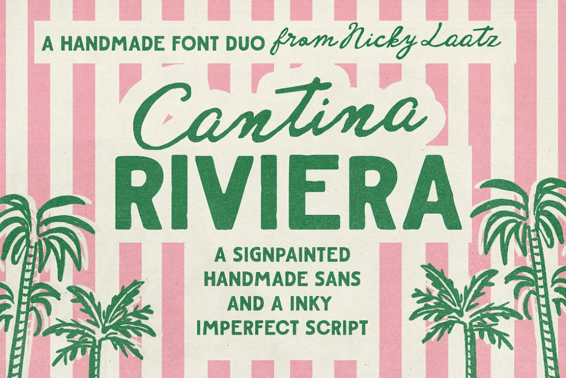
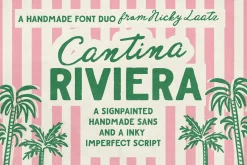
Say hello to ‘Cantina Riviera’!
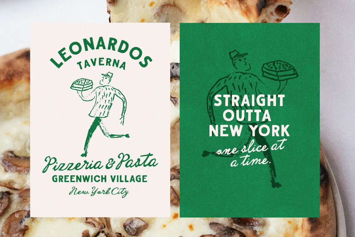
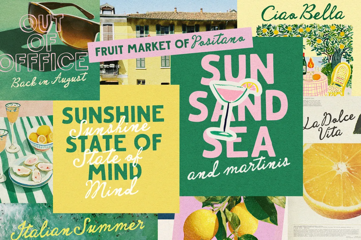
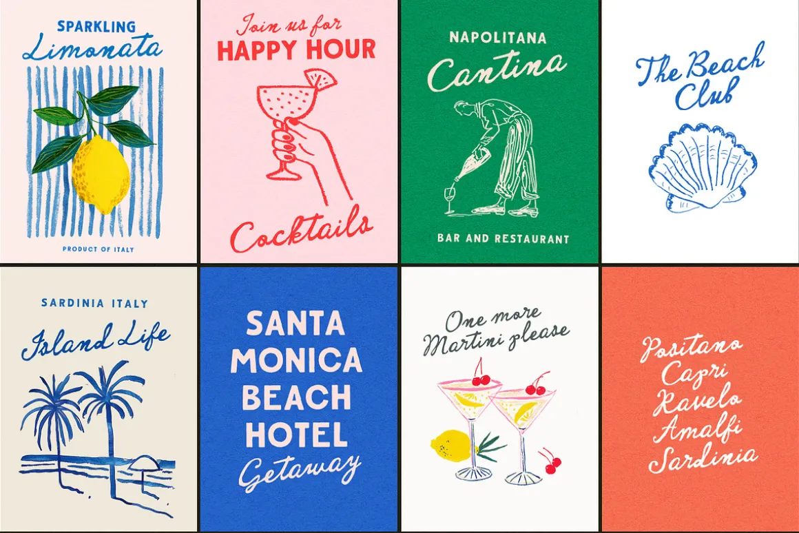
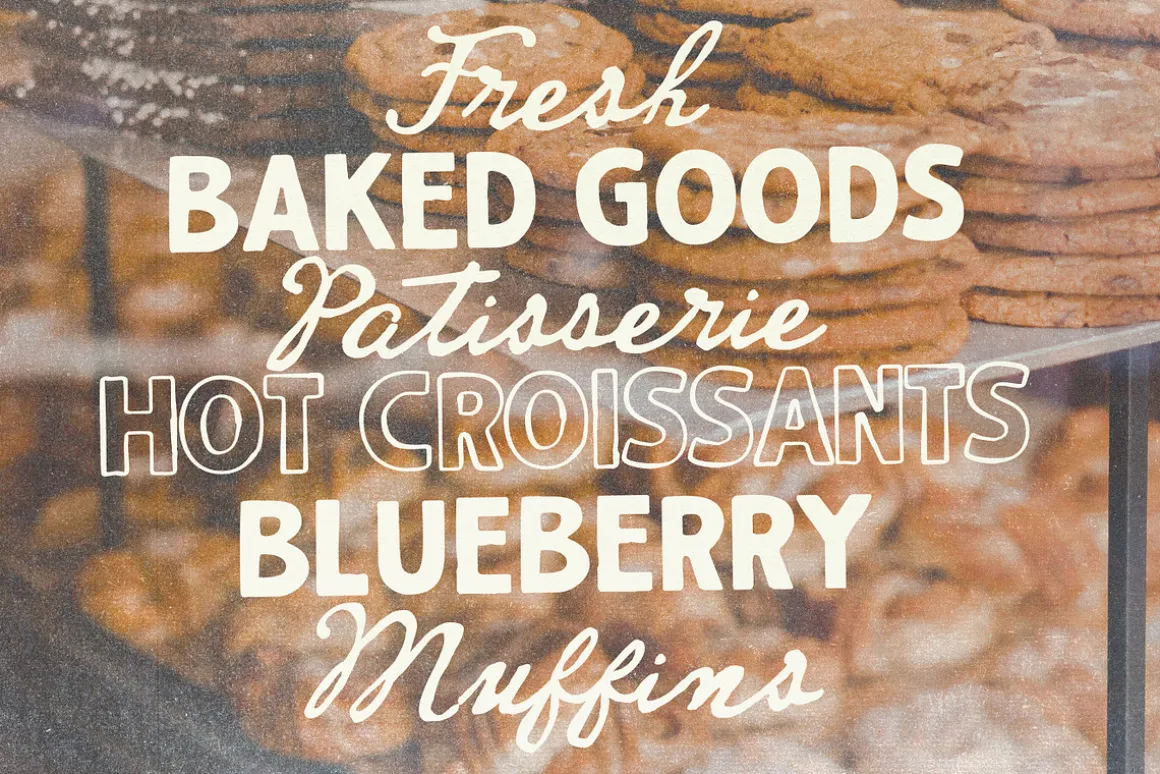
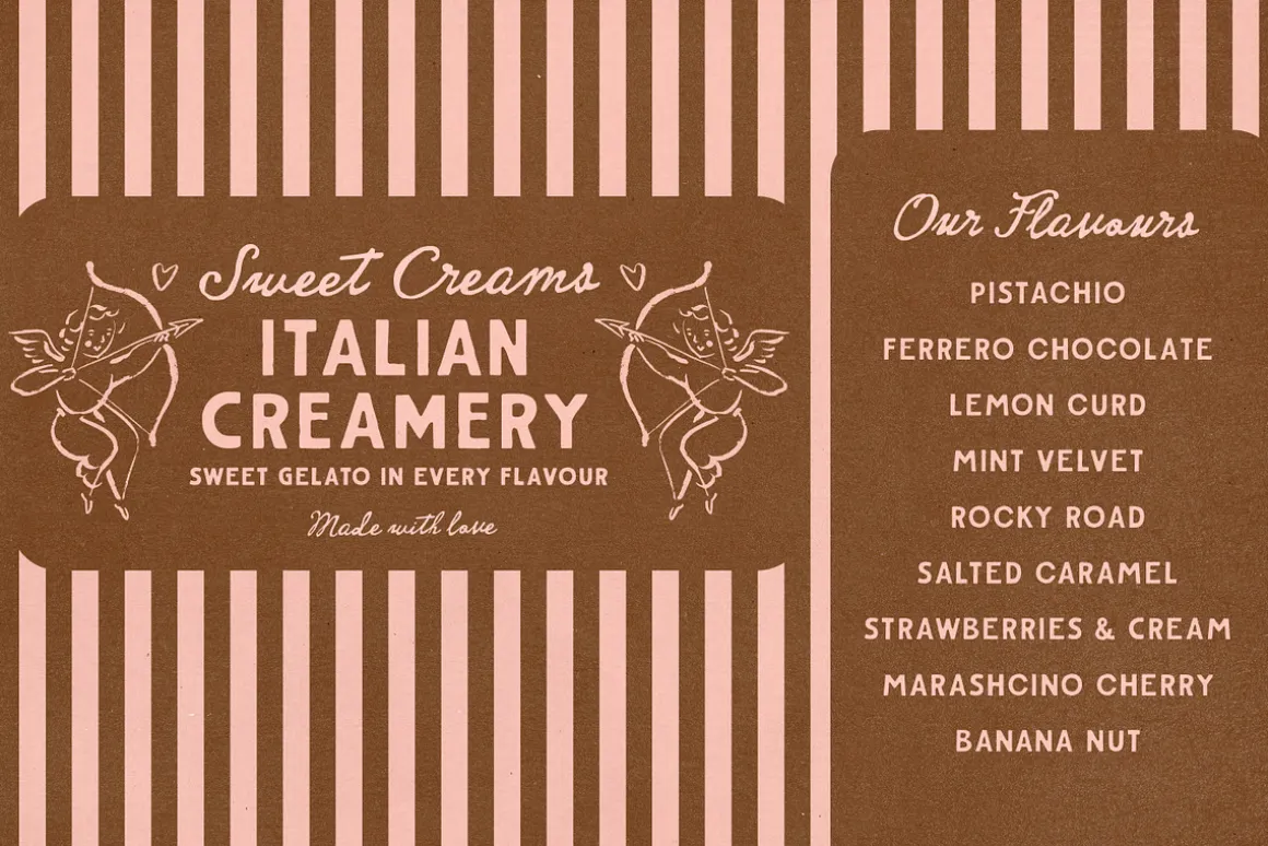
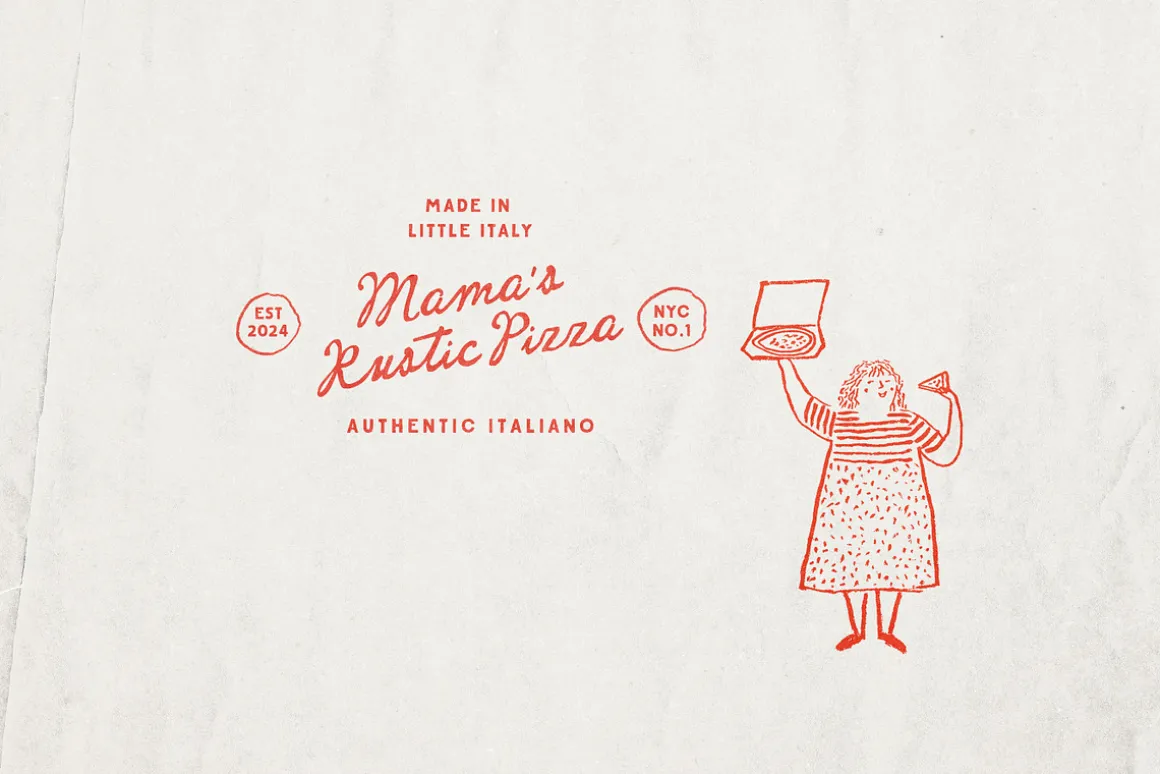
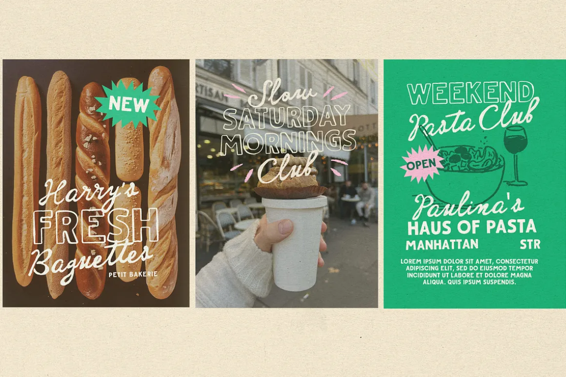
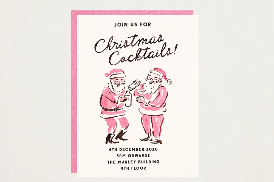
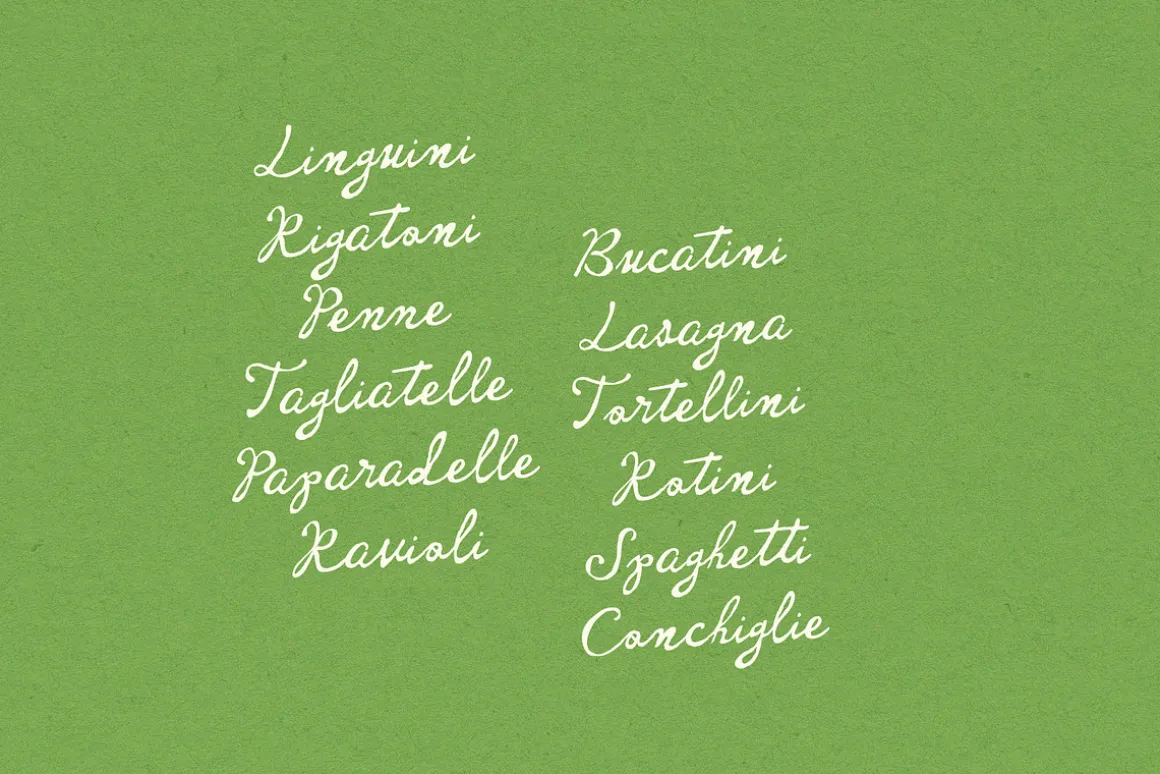
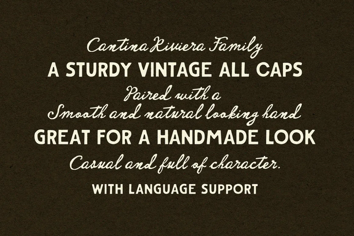
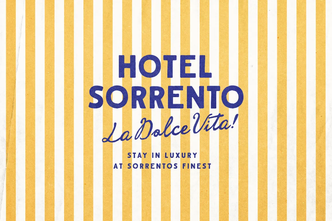
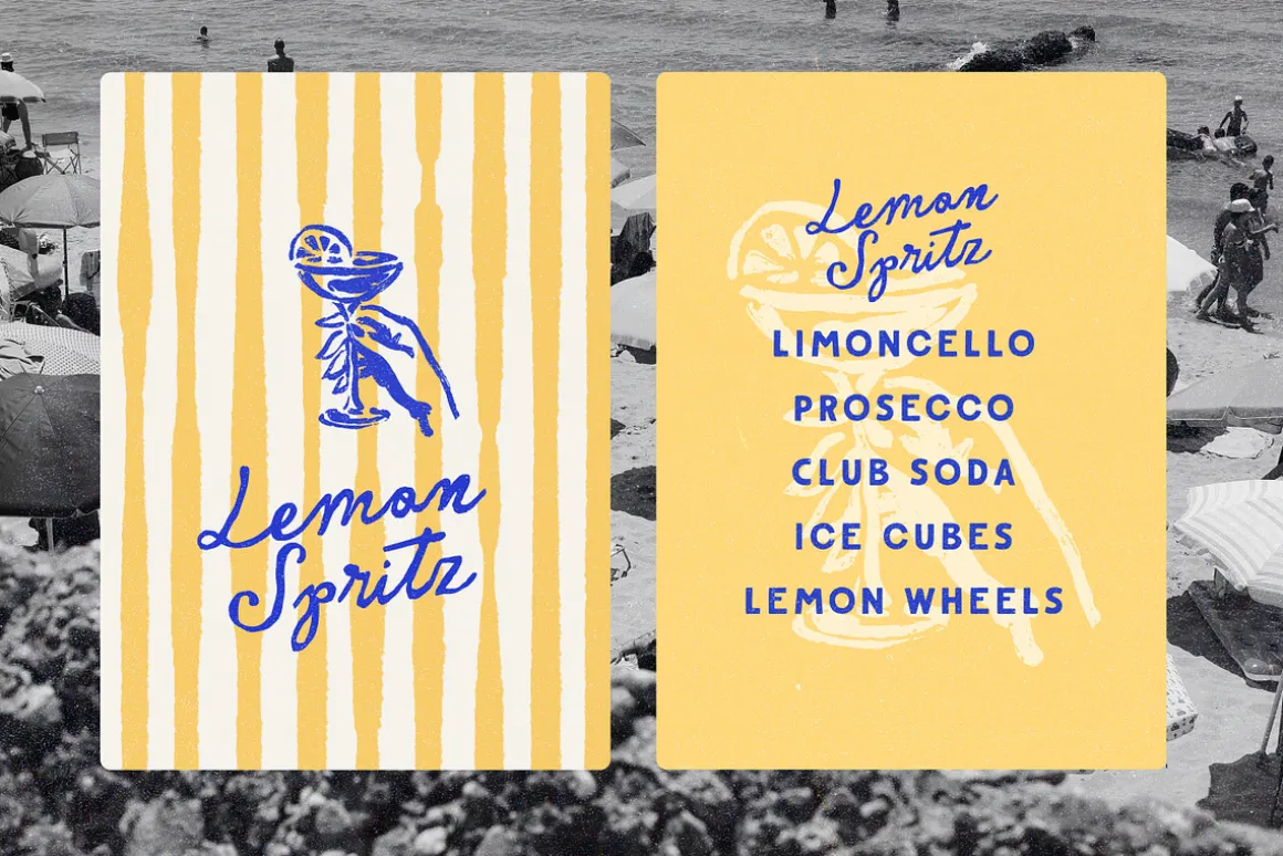
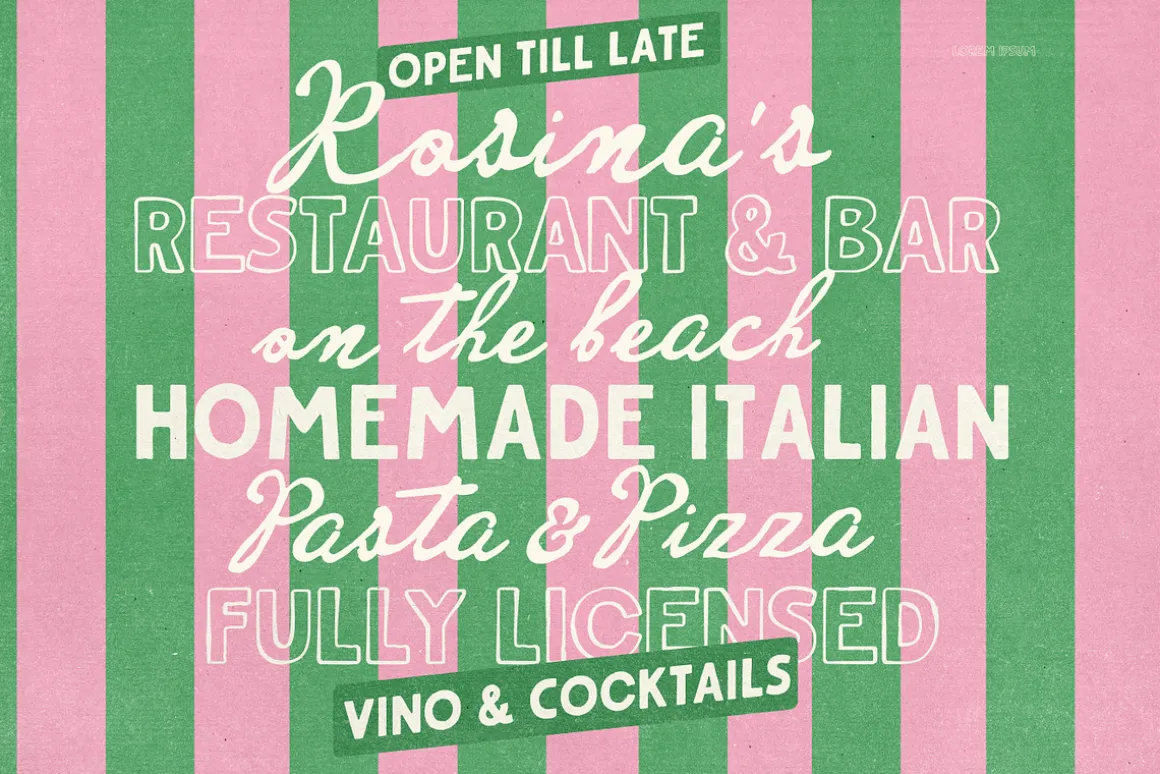
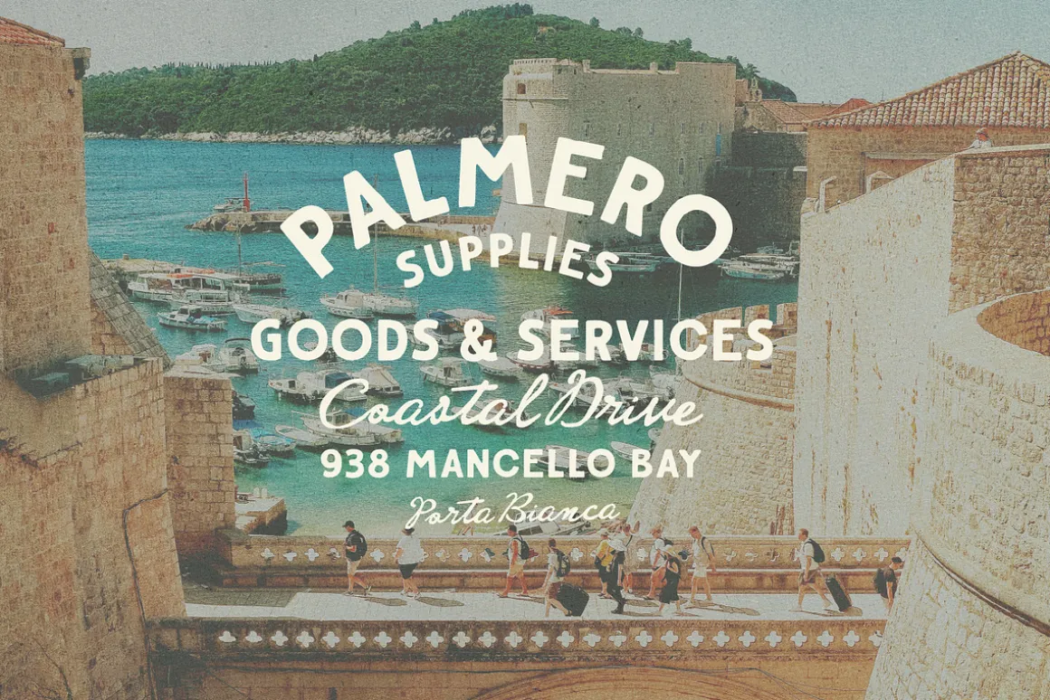
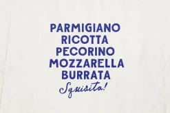
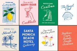
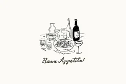
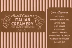
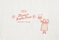
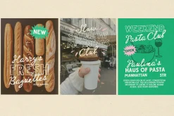
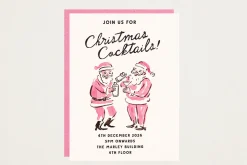
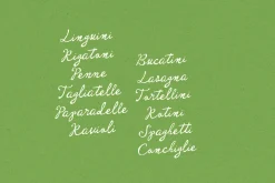
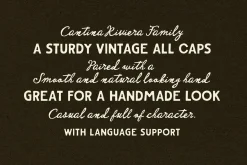
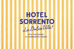
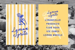
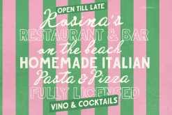
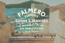
A Font duo inspired by traditional sturdy vintage sign painting, and typographic 50s matchbook designs. A bold, steady , rough edged sans couples with a fluid, inky, imperfect script. They were right when they said Opposites attract!
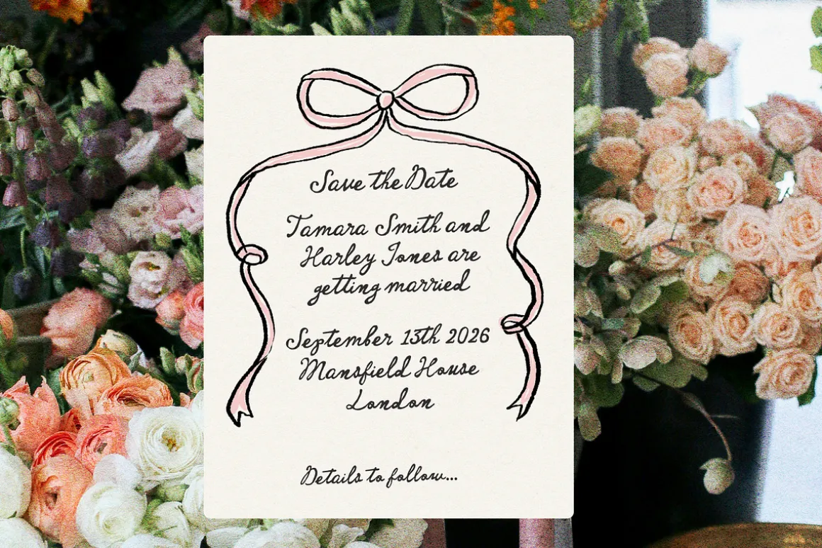
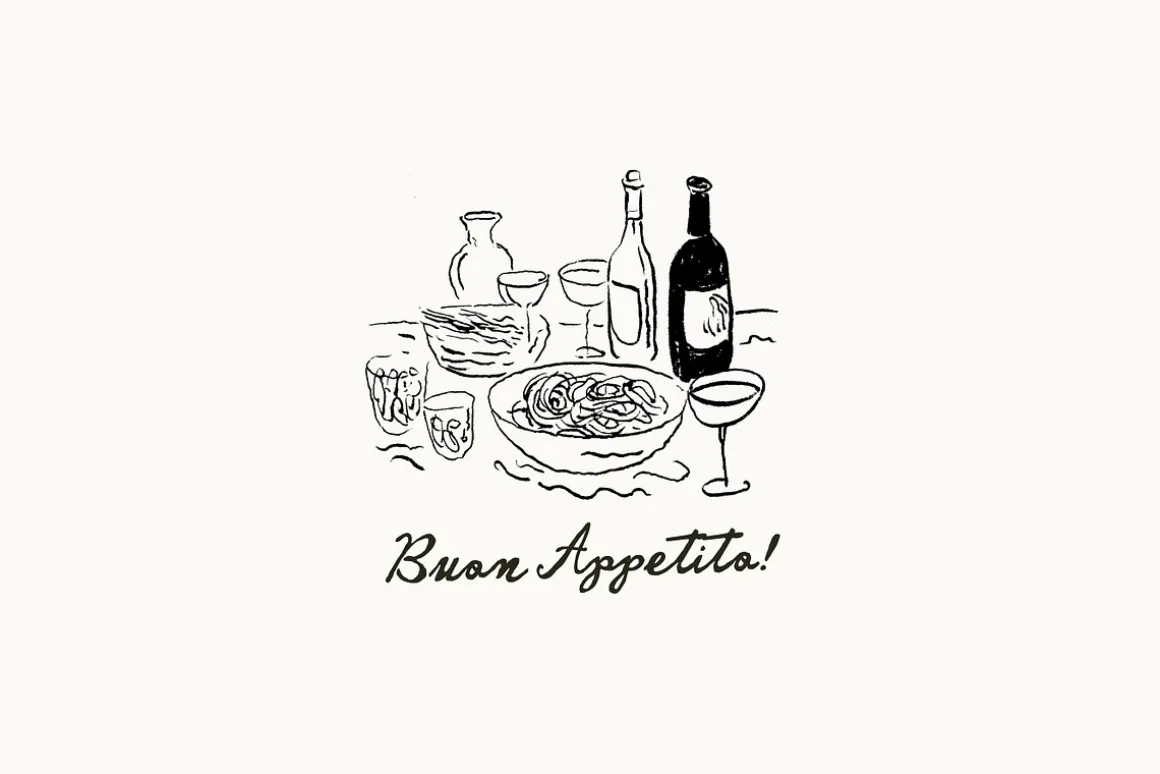
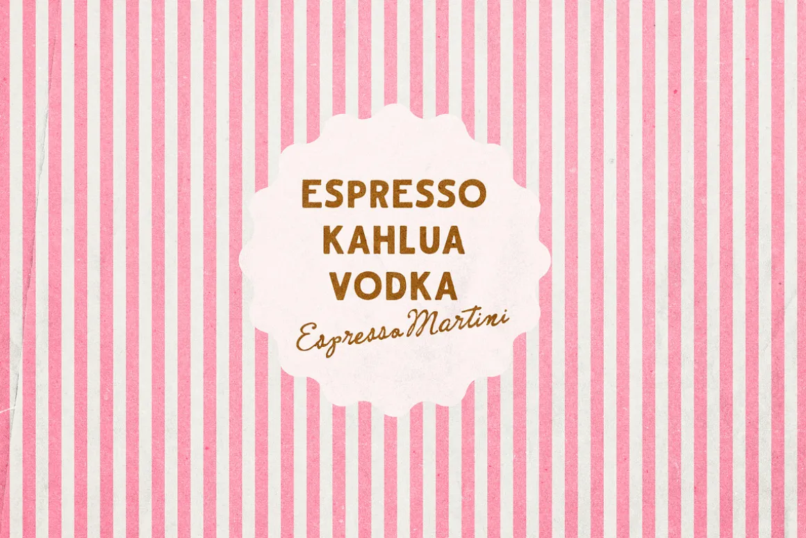
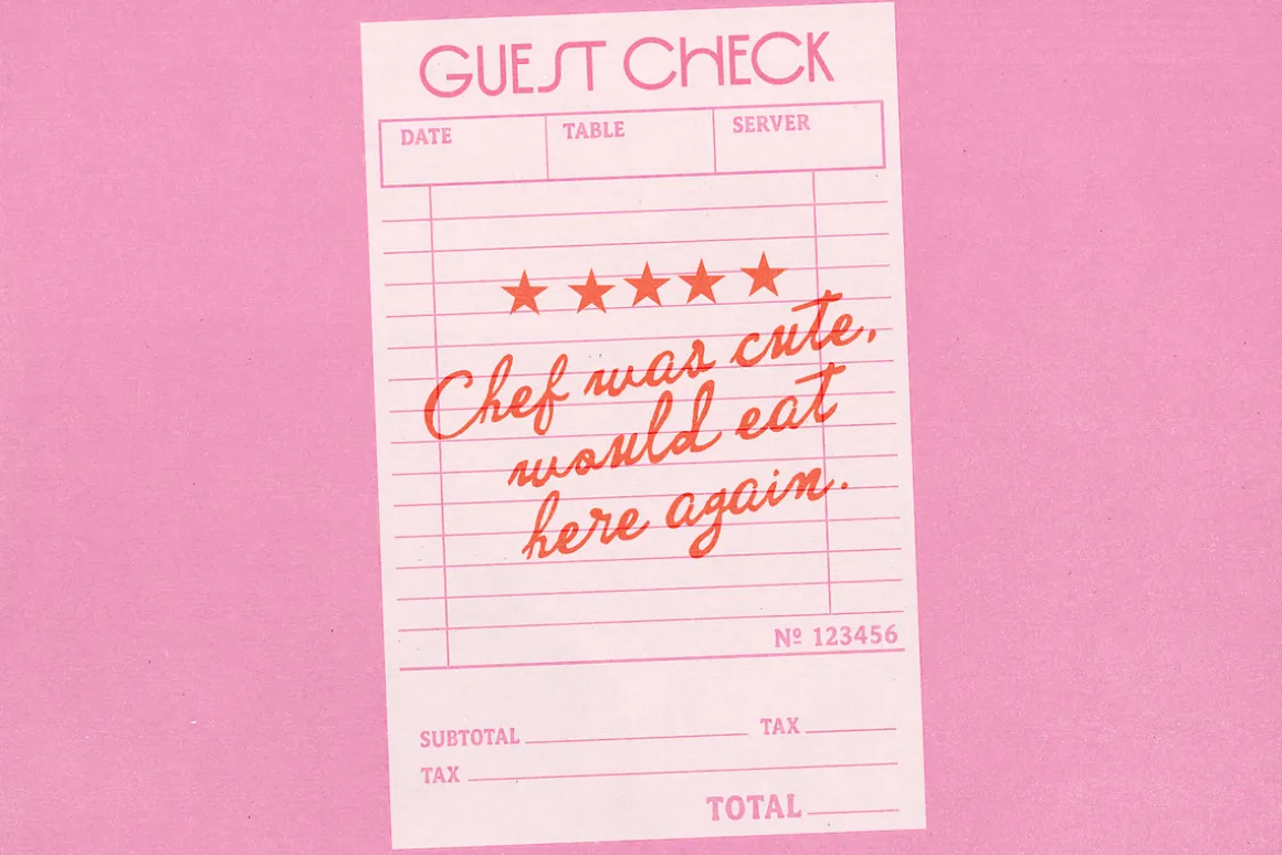
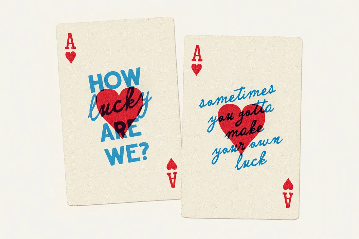
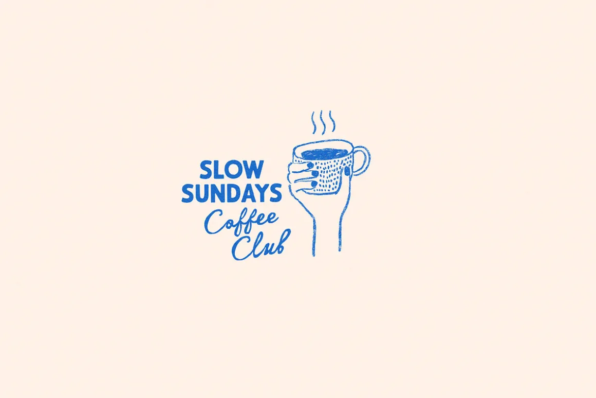
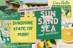
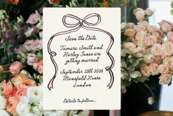
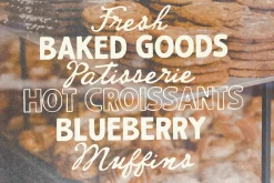
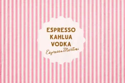
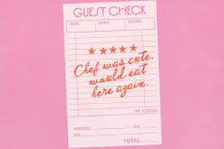
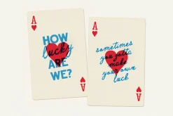
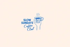
Perfect for bold branding, retro packaging, vintage editorial design, preppy posters, handwritten menus and wedding invites, and social graphics that pop 🙂
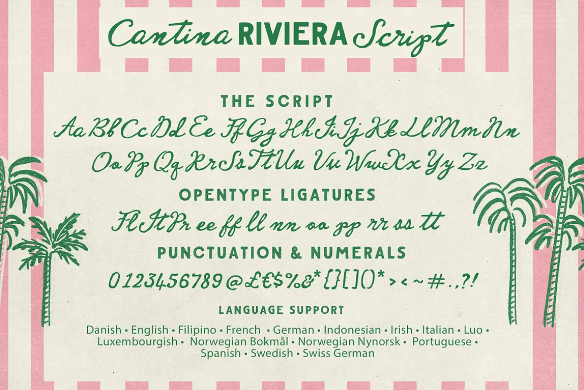
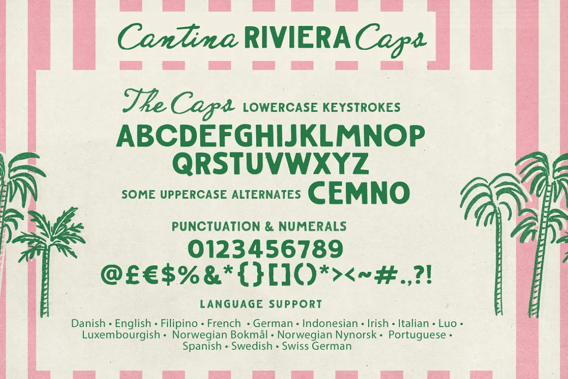
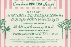
The Script has some extra double letter ligatures added to make sure its as natural looking as can be, and is PUA encoded if you require it. A few extra variants with very slight differences in slant and weight are included for you 🙂
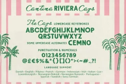
The Caps is available in a smoother version , if you would prefer less roughness, as well as an outline version, and a lighter version.
Language Support : English, French, Danish, Spanish, Swedish, German, Swiss German.
ENJOY!
| Size | App, Desktop, E-pub, Webfont |
|---|
Be the first to review “Cantina Riviera Font Duo”
Related products
Font Styles

Aesthetic Fonts

Font Styles
Font Eras
Aesthetic Fonts
Aesthetic Fonts
Aesthetic Fonts


Aesthetic Fonts
Font Eras
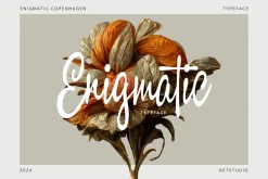
Brush
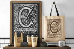
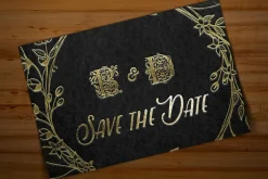

Elegant
Aesthetic Fonts
Aesthetic Fonts


Font Styles
Reviews
There are no reviews yet.