

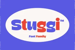
Stuggi — Font Family
22,89 $
About
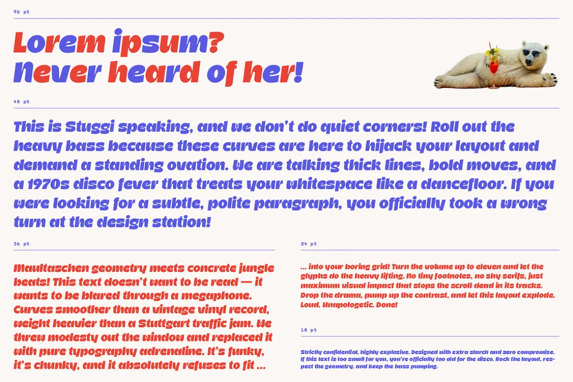
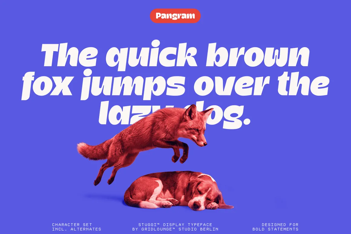
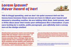
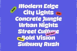
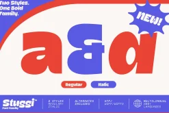
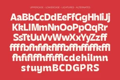
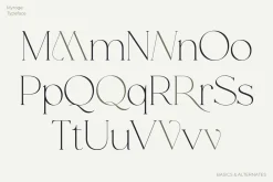
Stuggi extends into a small but expressive type system that works through contrast rather than variation for its own sake.
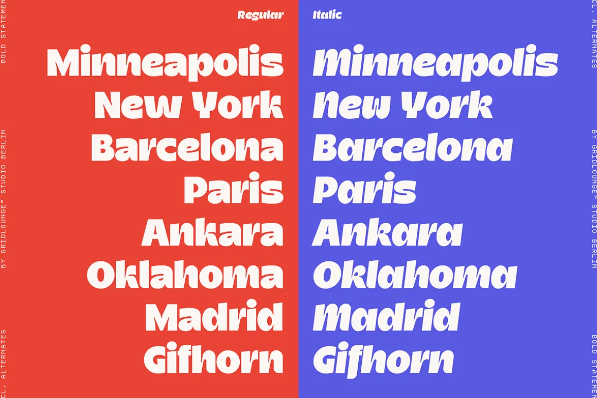
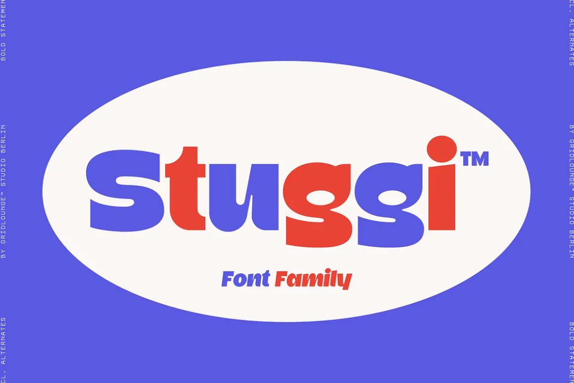
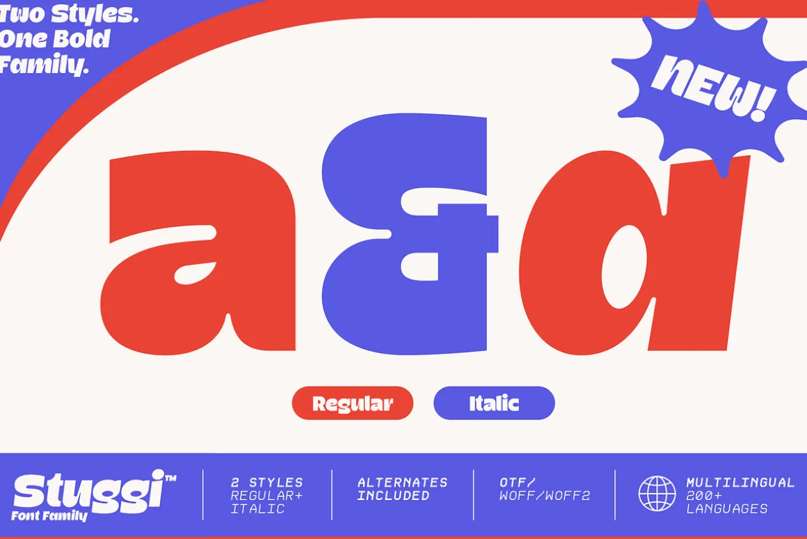
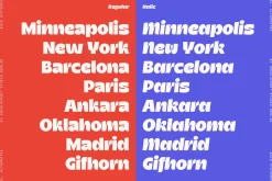
The family consists of two coordinated styles: Regular and Italic. Together they build a clear typographic relationship — one grounded and stable, the other directional and dynamic.
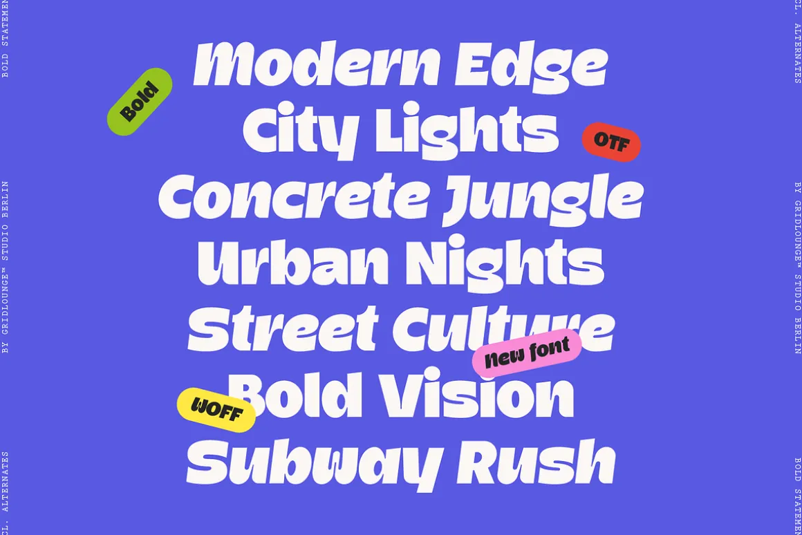
The Regular cut carries the core voice of Stuggi: structured, confident, and present. It establishes clarity and gives compositions a strong typographic foundation.
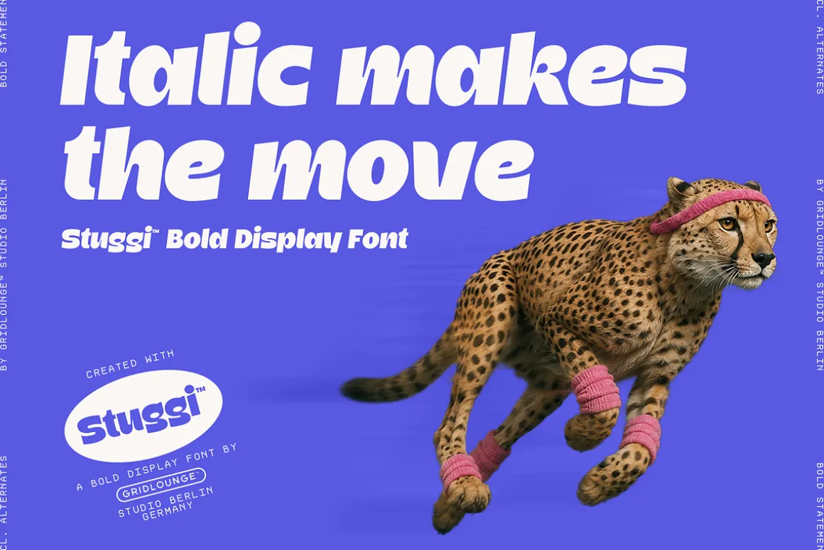
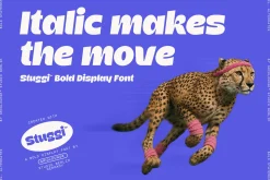
The Italic cut shifts that voice. It introduces movement, tension, and a slightly more expressive rhythm. Used together, both styles create hierarchy and energy within layouts without losing consistency.
Rather than functioning as separate design choices, the two styles are meant to operate as a system — allowing typography to move between stability and motion while staying visually connected.
Stuggi remains rooted in contemporary urban design language, designed for work that needs presence, but also control.
What’s included
-
Stuggi Regular
-
Stuggi Italic
-
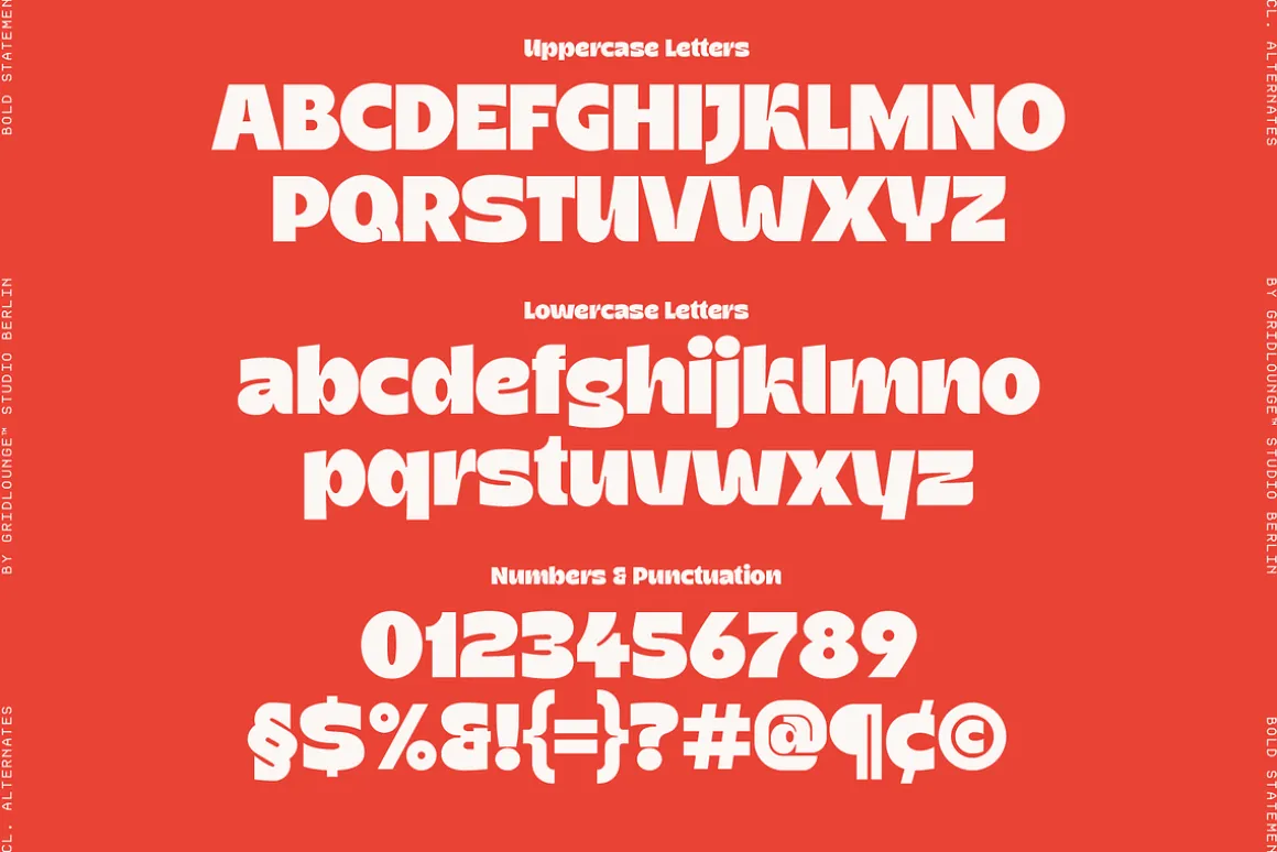
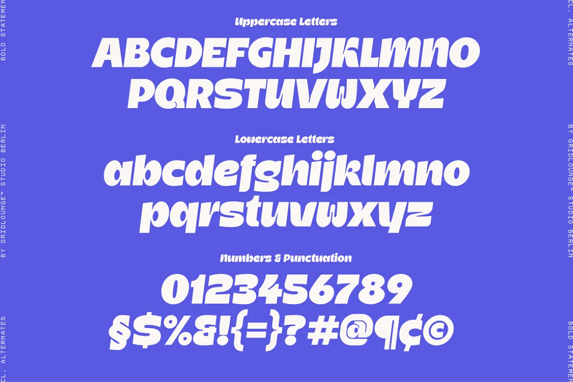
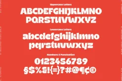
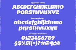
Uppercase & lowercase characters
-
Numerals & punctuation
-
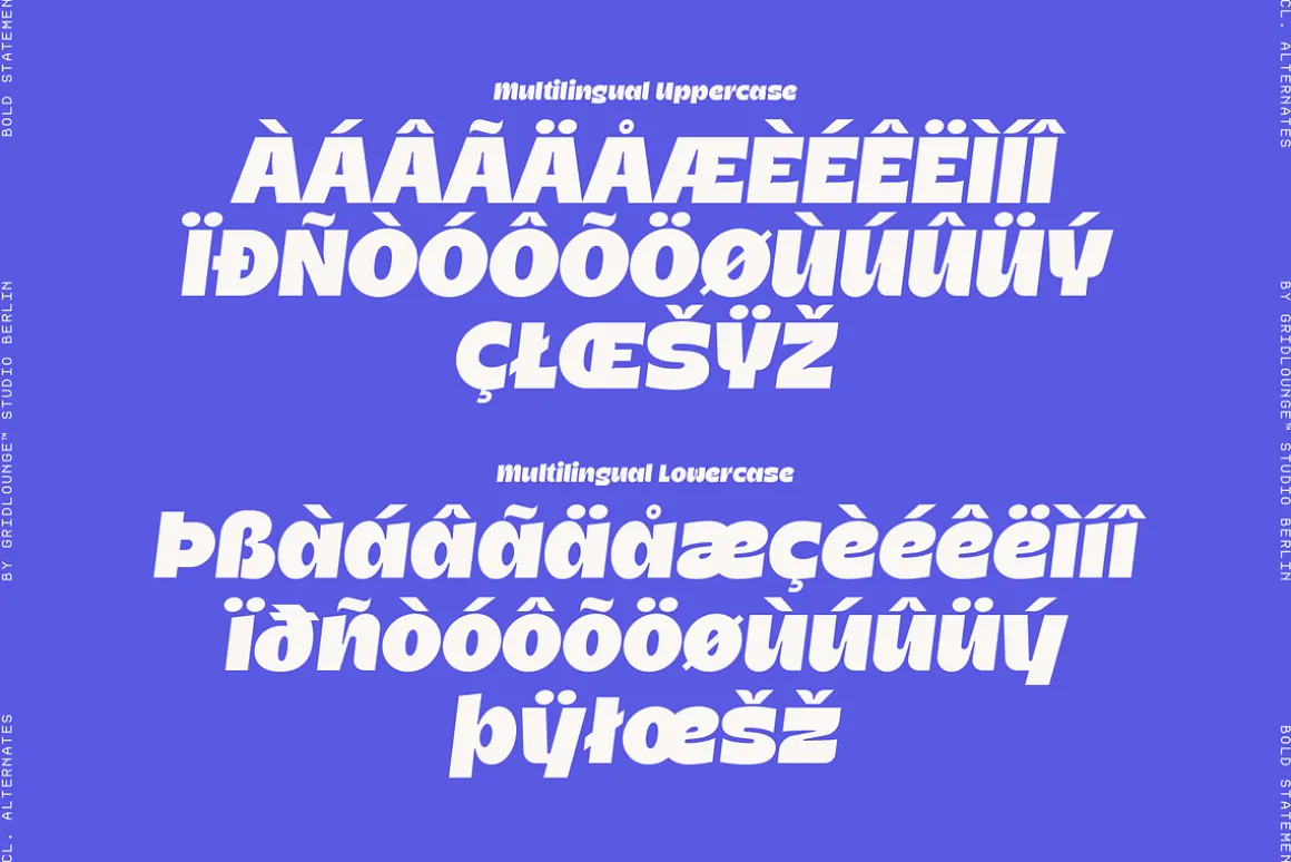
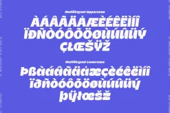
Multilingual support
-
Stylistic alternates
Best used for
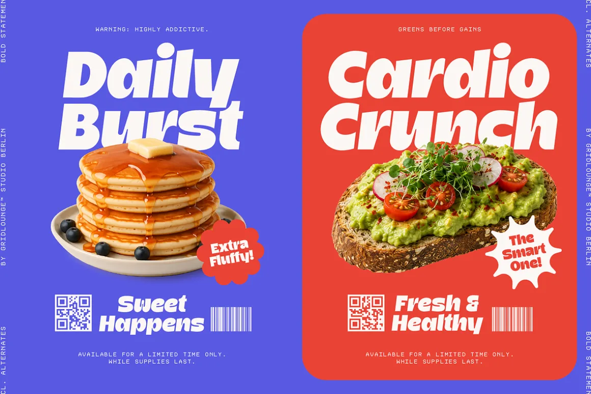
Brand identities, editorial design, posters, packaging, social content, and typographic systems where structure and contrast work together.
| Size | App, Desktop, E-pub, Webfont |
|---|
Be the first to review “Stuggi — Font Family”
Related products
Aesthetic Fonts
Aesthetic Fonts
Brush
Font Eras

Font Styles
Aesthetic Fonts

Aesthetic Fonts

Aesthetic Fonts


Font Styles


Aesthetic Fonts


Font Styles

Elegant


Aesthetic Fonts
Reviews
There are no reviews yet.